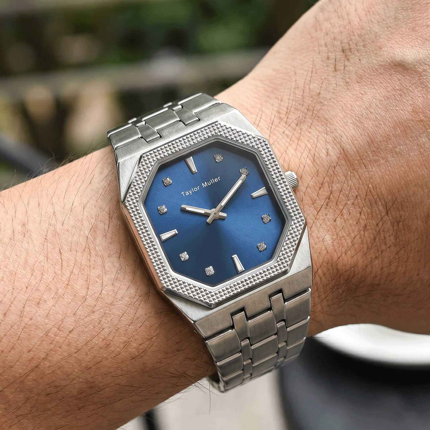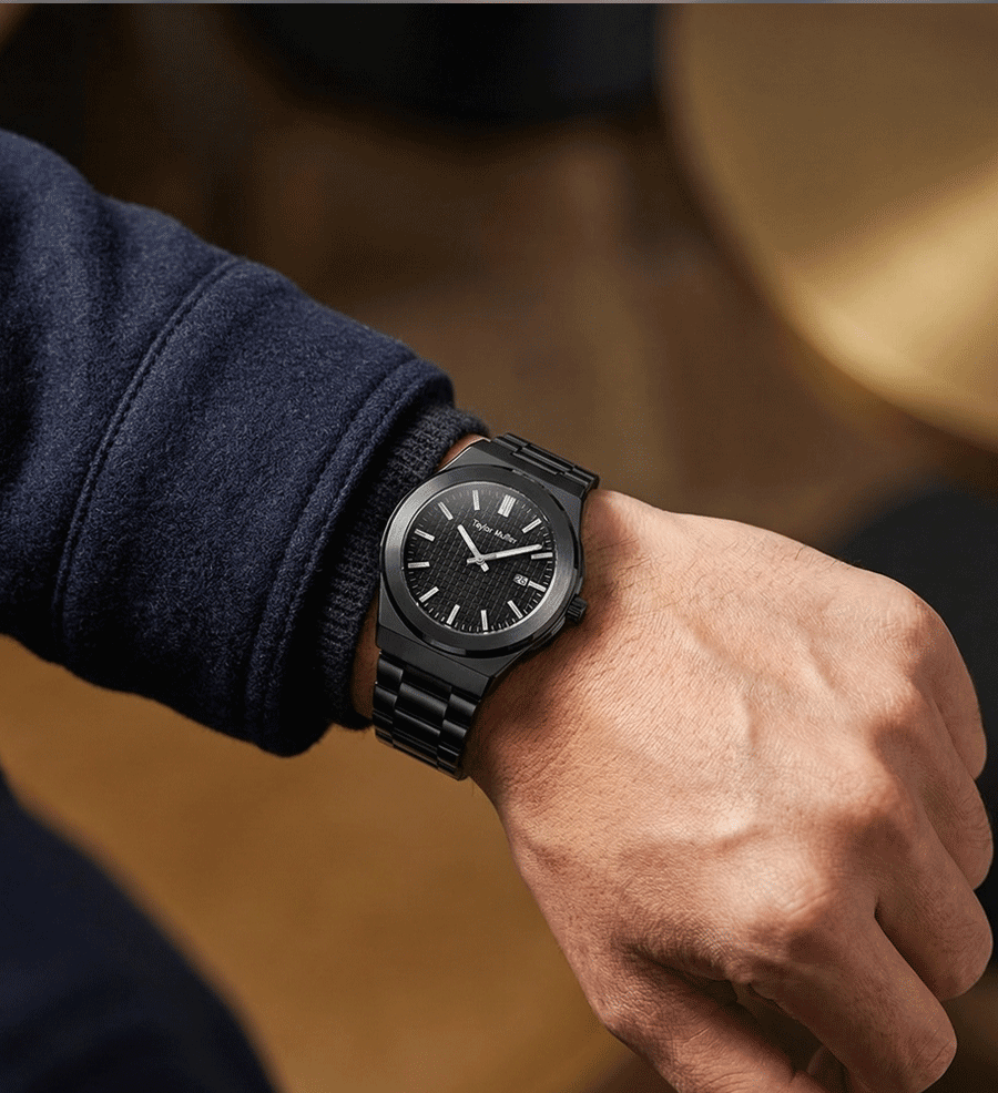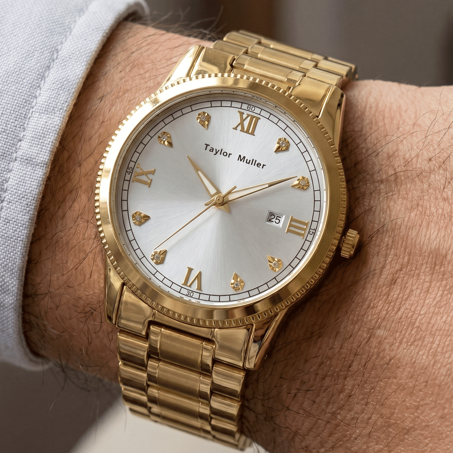
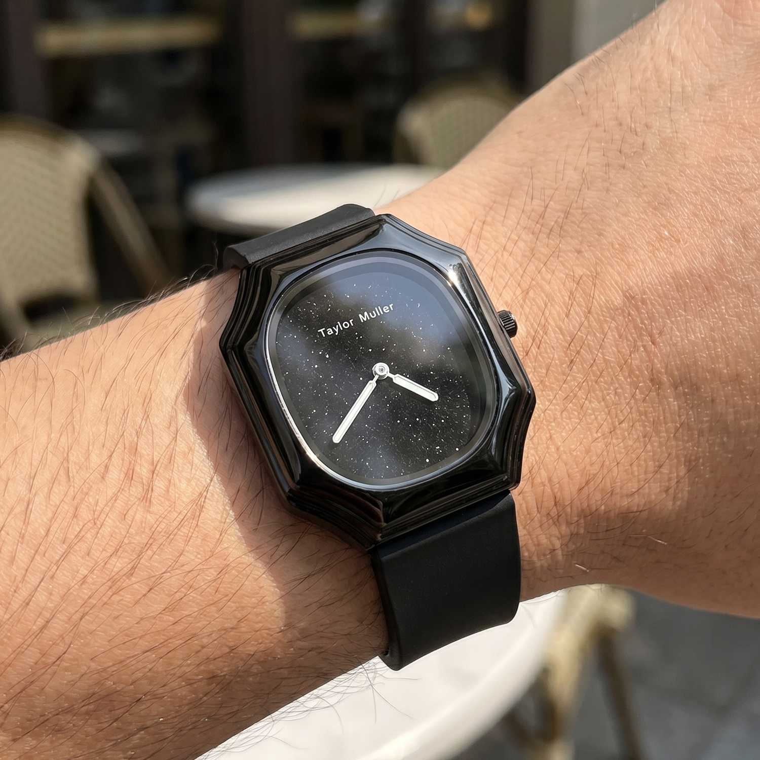
Some dials are beautiful in a photo and awkward in daily use, and the difference is rarely the dial itself. It is the hand set: how wide the hands are, how long they reach, how they contrast with the surface behind them, and whether there is enough luminous material to read the time in the dark. Those are five small decisions, and they either agree with each other or fight.
What the eye actually reads
Have a quantity in mind?
Tell us the model, the colours and the quantity — we come back with the exact MOQ, target price and lead time for your build, within 24 hours on working days.
- The hour hand first. Not the numerals, not the logo — the position and shape of the hour hand is what the eye locks onto.
- The minute hand second. It has to reach the minute track; a minute hand that stops short makes every reading approximate.
- The 12 marker third. It is the anchor for everything else, so it has to be distinguishable at a glance.
- Contrast all the time. A hand that disappears against the dial under one kind of light is a daily annoyance, not a design detail.
Five decisions that decide how it reads
| Decision | What works | What fails |
|---|---|---|
| Hand width | Broad enough to see at arm’s length | Very thin batons that vanish the moment the light is not perfect |
| Hand finish | Brushed or painted, with contrast against the dial | Mirror-polished hands on a silver dial: they reflect the dial and disappear |
| Hand length | Minute hand to the minute track; seconds hand close to it | A seconds hand that stops halfway: it looks like a mistake, because it is one |
| Lume area | Frames or wide hands that can hold compound | Thin hands with a printed strip: barely any glow |
| Marker hierarchy | The 12 is different — doubled, wider, or set apart | Twelve identical markers: you have to count at night |
The combinations that look fine in a photo
A textured sunray dial with broad hands photographs beautifully and can read badly, because the texture competes with the hand width. Polished hands on a light dial look elegant on a white background and vanish under a window. Lume on the hands but not on the indices gives a watch that glows asymmetrically at night — the hands are visible, the hour is not. And a date window that cuts into the 3 marker without changing the marker leaves a dial that looks like it lost something.
From our workshop
The hand set is chosen after the dial, not before: the length has to answer to the minute track, and the width has to answer to the texture behind it. A seconds hand that stops short is a fitting decision, not a dial defect — and it is the kind of thing a drawing will not tell you. On a sample we read the time at arm’s length, across a table, in daylight and in low light, and then decide whether the hands are doing their job. The finish options, including applied indices and the dial finishes they sit on, are on the OEM & ODM services page; the 29 references in the catalogue show how each combination reads in a finished watch.
What to put in the specification
Write the hand style (baton, leaf, dauphine), the finish (polished, brushed, painted), the length — especially where the minute and seconds hands end — the lume treatment (none, printed, set in frames), and whether the 12 is differentiated. Then look at the dial it will sit on: contrast is a property of the pair, not of the hand. If you send a photograph of a watch you like, we can tell you which of these choices produced that look.
A sample runs 15–20 days and its fee comes off the bulk invoice; production is 30–45 days after approval; MOQ is 300 pcs per model, or 200 pcs when only the dial logo changes on an existing reference. Readability is the cheapest thing to get right — and the easiest to notice later if it is wrong.
Further reading: Printed dial or applied indices? · Polished, brushed or two-tone: what case finishing really costs