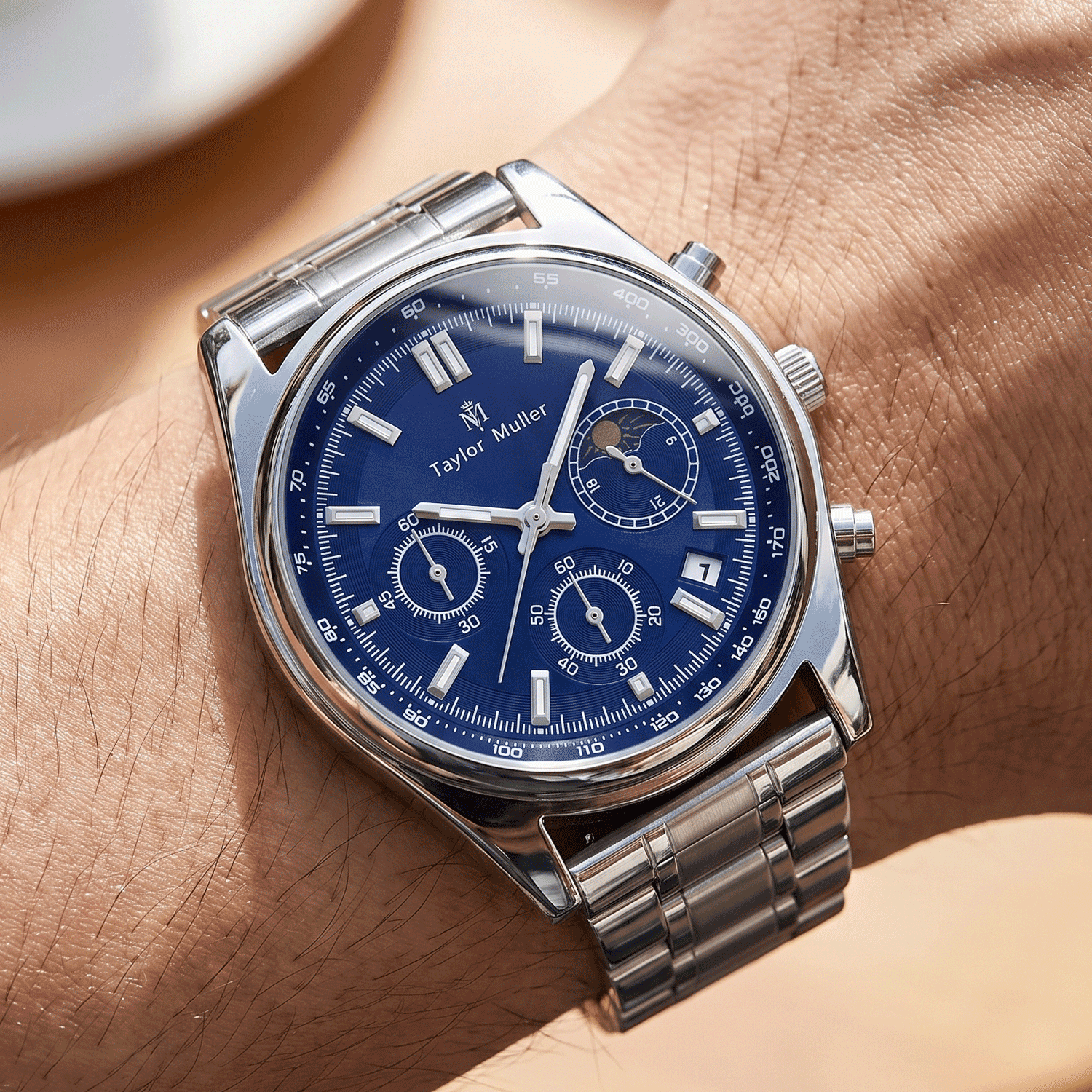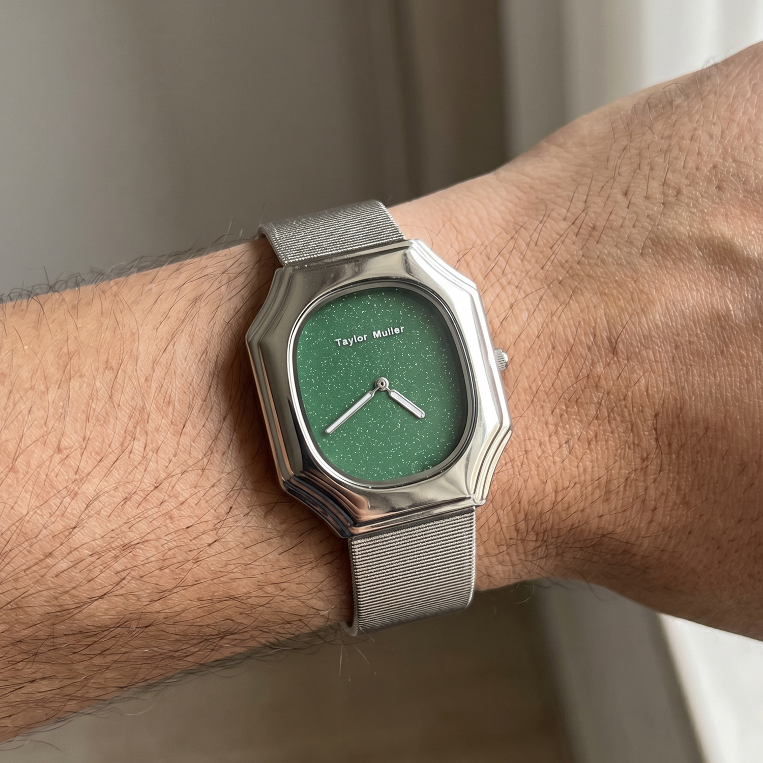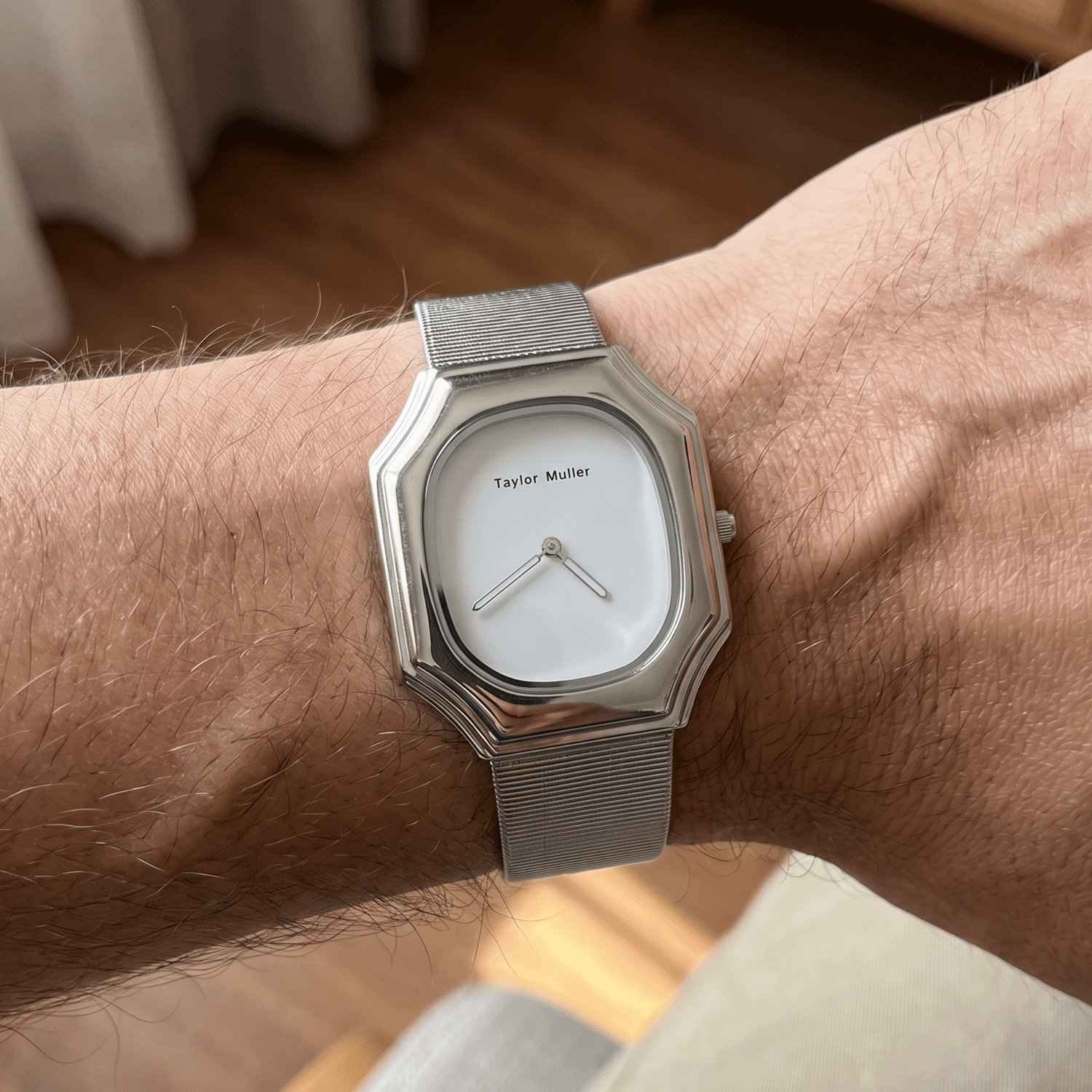
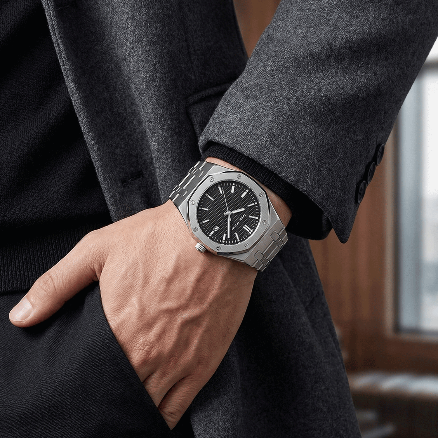
A new watch brand often asks for its logo on every possible surface. The result can look busy rather than branded. Each logo position has a different job: one identifies the product at first glance, one is touched every day, one is discovered after purchase, and another supports the retail presentation. The useful question is not how many logos a watch can carry, but which positions deserve one.
What buyers see first
Have a quantity in mind?
Tell us the model, the colours and the quantity — we come back with the exact MOQ, target price and lead time for your build, within 24 hours on working days.
The dial is visible before the watch is picked up. A dial logo has to work at a glance in photographs and in normal wear, not only as a large vector on a computer screen. The crown and clasp come next because they are touched directly. The case back is usually seen when the watch is removed or turned over, while a logo on the strap is noticed most when the watch is handled up close. That order is useful when a budget cannot support every branding method at the same level of quality.
Five positions and what each one does
| Position | Typical method | What it does | What to watch |
|---|---|---|---|
| Dial | Pad printing or an applied metal logo | Creates the first brand impression and has the most visible area | Small details, thin strokes, colour contrast and alignment with the markers |
| Crown | Laser, engraving or raised mark | Gives the hand a brand detail every time the time or date is adjusted | Very small surface area, edge clearance and whether the mark stays legible after plating |
| Clasp | Laser, engraving, stamping or a small plate | Puts the brand where the customer touches it most often | Depth, background contrast, sharp edges and wear from daily opening and closing |
| Case back | Laser, engraving or a printed/etched disc | Carries brand information, model details, serial numbers or a message | Layout density, line thickness and whether the marking remains clear across curved surfaces |
| Strap or buckle | Debossing, foil, stitching, etching or a metal tag | Adds a close-range signature and can support a more complete retail story | Surface texture, contact wear and whether the mark remains readable after cleaning |
Choose hierarchy, not repetition
- Start with the dial logo. If it is weak, adding four more versions will not build a stronger identity.
- Use the crown for a simple mark. A crown has little usable area; a wordmark that works on paper often becomes a smudge at that size.
- Treat the clasp as a daily touchpoint. A clean mark with enough contrast usually matters more than a complicated design.
- Give the case back a separate purpose. It can carry the model, serial number and warranty information instead of repeating the dial design.
- Keep the strap quiet unless it supports the product. Leather, silicone and steel each take a mark differently, and that difference should be visible on the sample.
From our workshop
Logo placement is not a file dropped into the last step. The artwork has to be tested against the actual production method because a printed line, an engraved line and a raised metal logo do not hold detail in the same way. On a crown or clasp, we reduce the artwork to what remains readable on that small surface rather than forcing the full lockup into it. On the case back, we check the curve and the proposed marking depth before the layout is approved. The most common problem is not that the logo is too small; it is that the same artwork is scaled down without simplifying its lines.
We make the case in our workshop and buy the strap to match it. That lets us check the practical path from choice of logo position to tooling, sample and final assembly in one place. The full customization list is on the OEM & ODM services page, and the 29 references in the catalogue show how restrained branding can still remain visible in a finished watch.
What to put in the branding specification
Supply vector artwork and state every position you want marked. For each position, say whether the mark is printed, engraved, laser marked, embossed, applied or on a metal plate. Give a minimum line thickness or tell the factory to adapt the artwork where needed. Confirm the position and scale against the technical drawing, and decide whether serial numbers or other variable data will appear on the case back. If the logo must keep a particular colour, add the colour reference and the intended surface finish. A branding sheet is strongest when it explains hierarchy: the primary mark, the secondary details and the surfaces that should stay clean.
A sample runs 15–20 days and its fee is deducted from the bulk invoice; production is 30–45 days after approval; MOQ is 300 pcs per model, or 200 pcs when only the dial logo changes on an existing reference. Choose logo positions for the way the watch is seen, handled and remembered, not simply because space is available.
Further reading: Printed dial or applied indices? · Leather, steel or silicone: choosing the strap