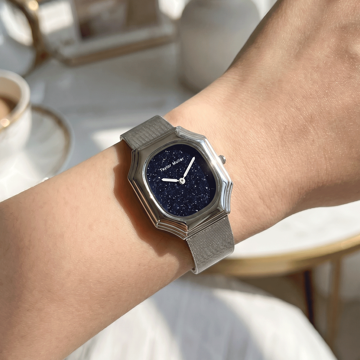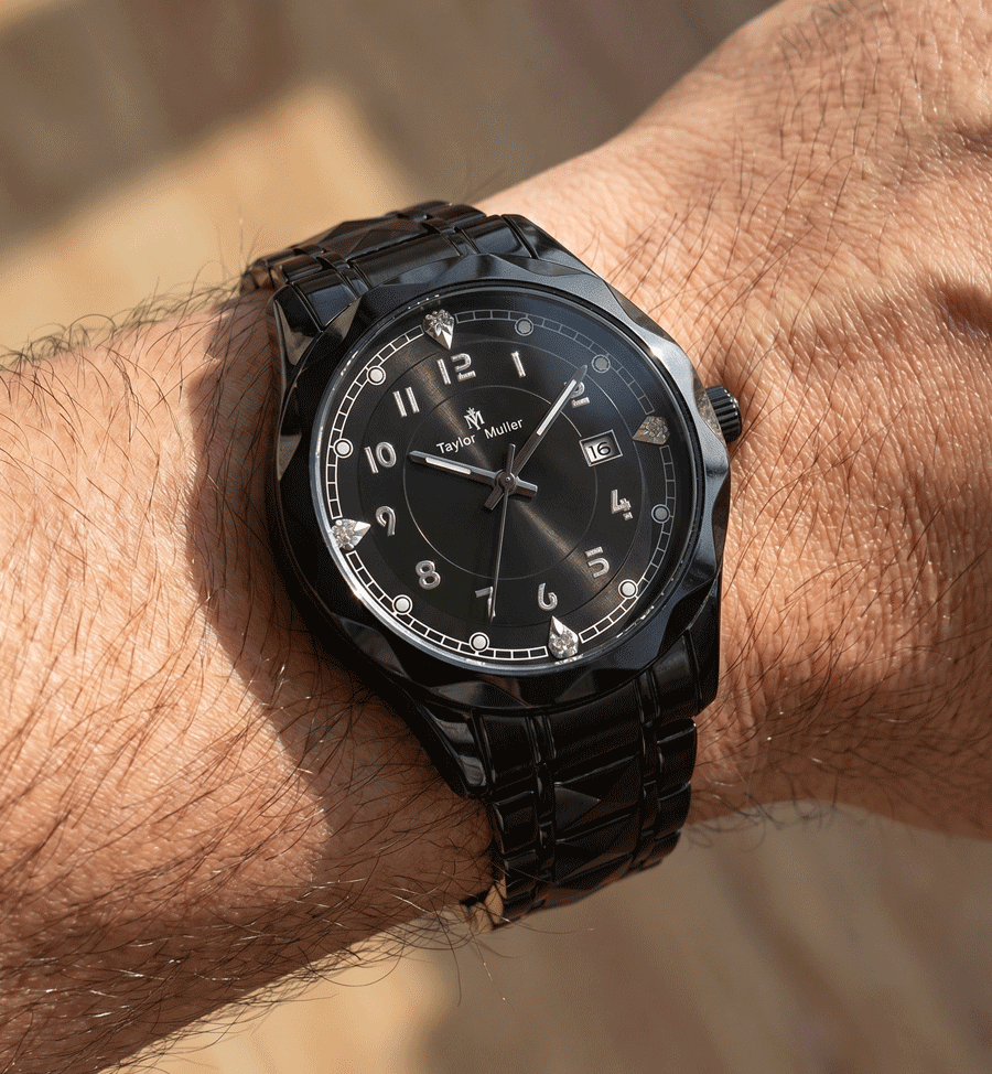
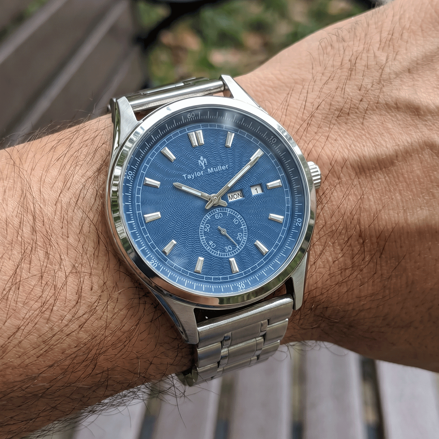
A dial colour that looked right in the sample can arrive subtly different in bulk. The change may be a slightly cooler blue, a darker grey, a stronger grain or a gloss level that was never visible in the first photograph. It is not automatically a defect. In many cases, the factory and buyer never agreed on enough detail to judge the colour consistently.
Colour on a watch dial is a material result, not a digital value. The base surface, finish, ink, coating, viewing angle and light all take part. If any of those changes, the final appearance can move even when the stated Pantone reference stays the same.
The same colour name covers different surfaces
Have a quantity in mind?
Tell us the model, the colours and the quantity — we come back with the exact MOQ, target price and lead time for your build, within 24 hours on working days.
“Blue” does not tell a supplier whether the dial is matte, sunray, enamel, gradient, textured or lacquered. Two dials made to the same basic colour reference can look noticeably different because the finish changes how light leaves the surface.
| What changes | Why the colour moves | What should be agreed |
|---|---|---|
| Dial base | The metal and base coat influence the layers above them. | The exact reference and base colour used for approval. |
| Surface finish | Matte, sunray, stamped texture and lacquer reflect light in different ways. | Finish name plus a physical sample of that finish, not a generic colour chip. |
| Ink or paint batch | Printing thickness and a new material batch can shift density or warmth. | Keep the approved standard and review the first production piece against it. |
| Clear coating | Gloss, satin and protective layers alter contrast and perceived depth. | The coating type, gloss level and acceptable final appearance. |
| Viewing conditions | Cool office light, warm shop light and a phone screen make one dial look like two. | One agreed viewing condition and a master sample kept away from daily handling. |
A Pantone code is a target, not the whole specification
A Pantone reference is useful, but it only defines a colour target. It does not define the material, surface, ink thickness or gloss. A code chosen on a paper swatch can land differently on a brushed metal dial, and a colour that looks right in a flat image may look too dark once a domed crystal and applied indices are fitted.
For a production-ready brief, write the colour reference, the exact dial finish and the desired gloss or matte level together. Add the index style, hand colour and lume tone because those elements change the contrast around the colour. Our guide to printed or applied indices explains why construction belongs in the same decision.
Approve a physical master before production
Email approvals are useful for timing, but they are weak colour standards. A photograph carries the camera’s white balance, compression and screen settings. The safest approval is a physical dial or complete watch that has been signed and dated, with a working reference kept separately from the sealed master.
- Name the standard — record the colour reference, finish, coating and whether the approval was made on a dial or a complete watch.
- Compare in neutral light — look at the master and the first production piece from straight above and at an angle.
- Check other parts together — indices, hands, lume and the case finish can make an unchanged dial colour read differently.
- Approve the first production piece — the sample is the design reference; the first bulk piece confirms the production process.
- Control changes explicitly — if the ink, coating or dial supplier changes, treat it as a new colour approval.
What the factory needs from you
Give us a reference we can compare, the finish in words, and the parts whose colour must stay together. Say whether you care most about the dial matching a brand colour, matching an earlier stock batch, or staying consistent within the new order. Those are related, but not identical, requirements.
We can build the case, dial, assembly and final checks under one roof, while movements and straps are selected to match the model and market. That makes one workshop accountable for the complete look, but it does not remove the need for one clear colour standard from the buyer. The factory page shows where those controls sit, and our FAQ covers related questions about materials and compliance.
For a new order, send the colour reference, finish, a clear photograph for orientation and any physical standard you already own. We can discuss the sample route without guessing. Full customization starts at 300 pcs per model; a dial-logo-only change on an existing reference starts at 200 pcs. Samples usually take 15–20 days, followed by 30–45 days for production after approval.
Colour consistency starts before plating, printing or assembly. It starts when the standard is specific enough for both sides to look at the same object and make the same decision. Browse the watch references to see the constructions we can work from.